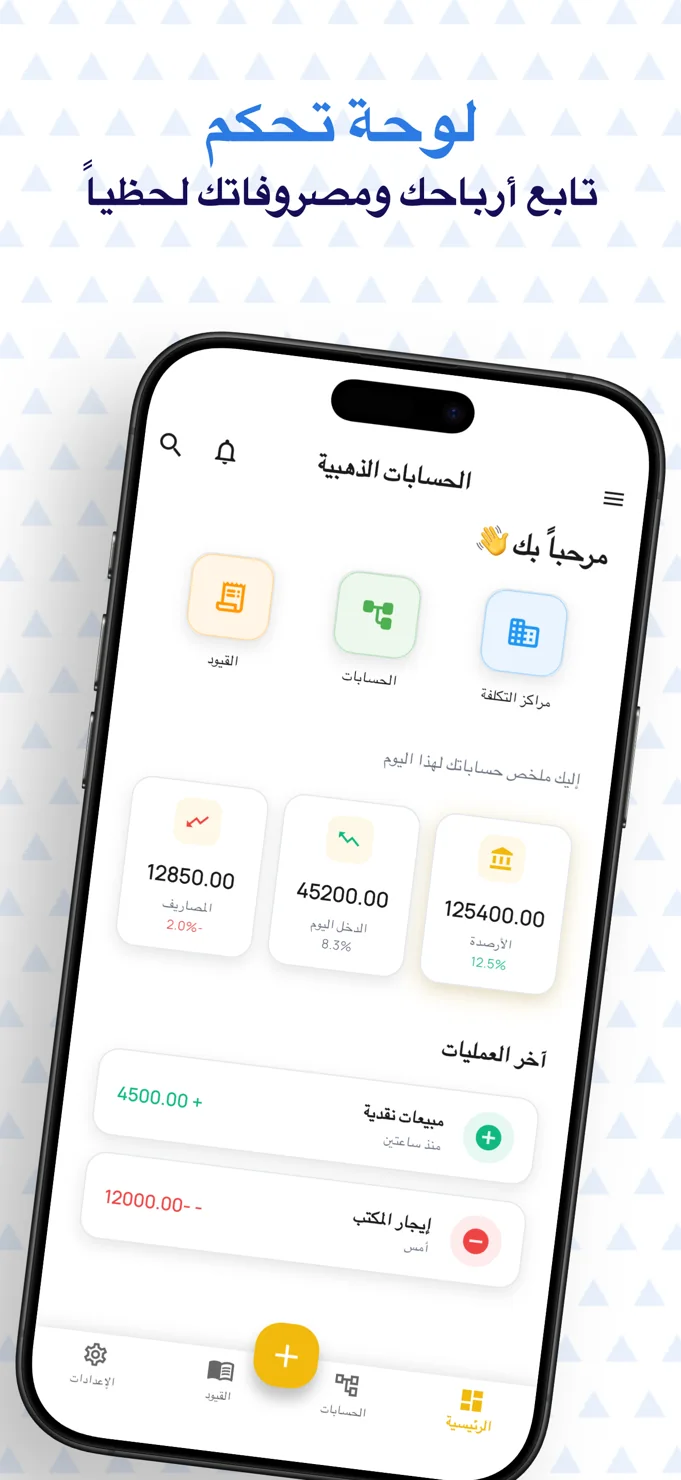

08Project story
Electron
A clearer view of the distributor’s working day.
Electron brings stock, buying and selling entry points, wallet information and transaction notifications into a mobile workspace for product distributors.
- Field
- Orders & distribution
- Experience
- Mobile application
 Inside the product
See stock and wallet context
Follow a staged purchase flow
Track transaction notifications
Project story
The project, at a glance
- The user need
- Users need an understandable entry point into the services shown by the product.
- The interface approach
- A consistent navigation structure and distinct content areas organise the mobile experience.
- What the public screens show
- The published portfolio screens show the product interface, destinations and content hierarchy.
This summary is based on the project screens already published in this portfolio. Usage statistics and business performance are not reported here.
Explore the supporting screens →01 / The idea
Bring the working picture into one view.
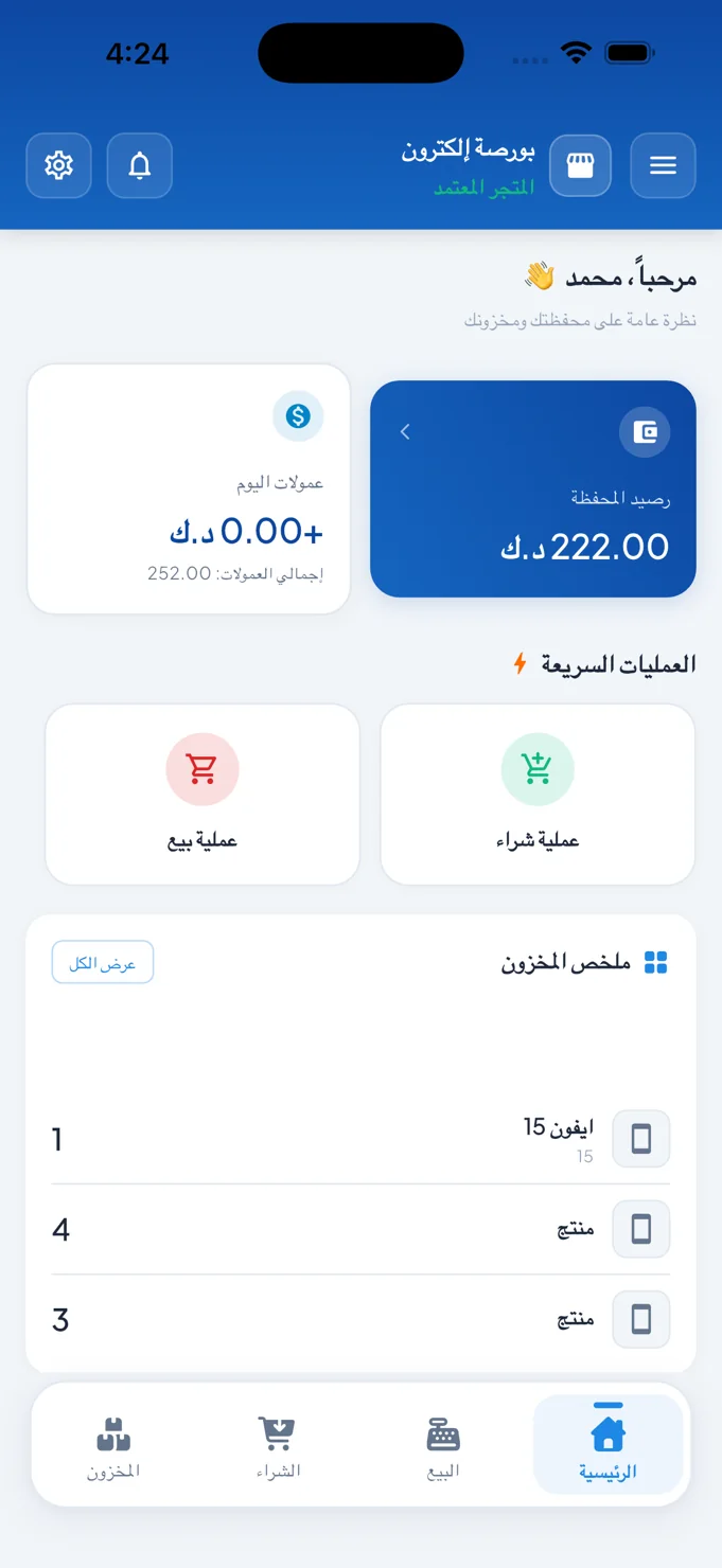
A distributor’s workflow involves more than a product list. Stock, transactions and financial context all shape the next action. Electron’s dashboard brings a wallet balance, commission summary, purchase and sale shortcuts, and a stock overview into the same mobile workspace.
The bottom navigation separates inventory, buying, selling and home. This structure lets the dashboard remain a concise starting point while giving the operational areas their own destinations. It is a working interface built around repeated tasks rather than a catalogue meant only for browsing.
02 / The experience
Make a complex transaction a readable sequence.
The purchase screen divides the journey into named stages: product, seller, price, payment and confirmation. This visible sequence tells the distributor where the current action sits in the broader transaction and which decisions come next.
The first stage brings product lookup together with serial-number entry. A UPC search field, product information and serial controls establish the identity of the item before the flow moves to choosing a seller. For individual devices, that specificity is an important part of the interface’s organisation.
A staged flow is useful when each step makes one part of the transaction explicit.
03 / Key details
Tools for the operational details.
A dashboard with business context
Wallet and commission cards sit above quick purchase and sale actions. An inventory summary provides a snapshot of listed products, with a separate route into the wider stock view.
Product and serial-number entry
The purchase interface includes UPC lookup and serial-number fields with scan affordances. The product name, barcode and displayed purchase price share the screen, keeping the selected item identifiable.
An organised notification feed
The notification screen separates all items, unread items, transfers and wallet events. Individual cards communicate delivery updates, transfer activity, commission entries and pricing notices with their own timestamps.
04 / The user journey
From the dashboard to the transaction.
Check the starting position
Review the dashboard’s wallet, commissions and stock summary, then choose the relevant purchase or sale entry point.
Identify the product
Use the product lookup and serial-number controls before continuing through seller, price, payment and confirmation stages.
Review the activity feed
Use the notification categories to find transaction updates, transfer events and wallet-related activity.
05 / The screens
A closer look inside.
Explore the interface, screen by screen. Select an image to see the detail.
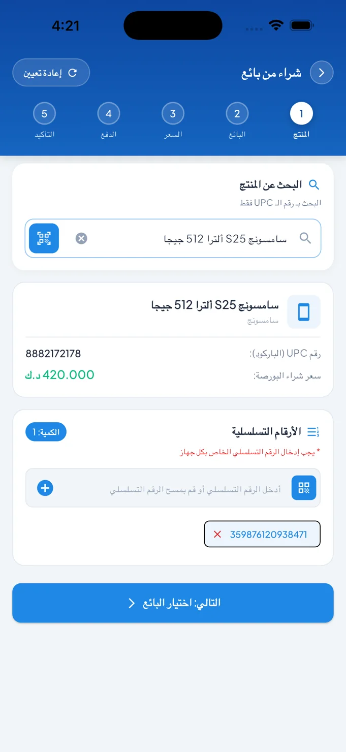
The first purchase stage
Product lookup, barcode context and serial-number entry sit within a five-stage flow.
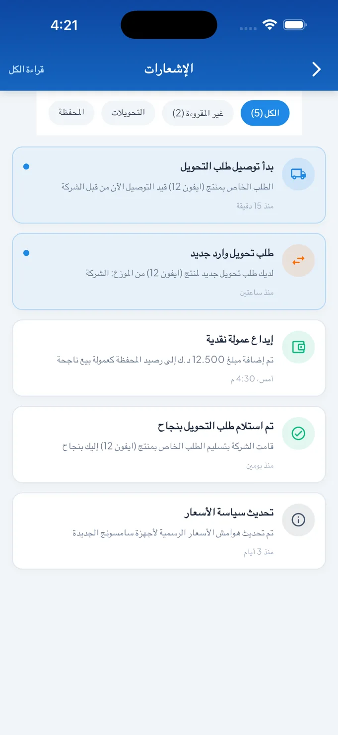
Operational notifications
A categorised feed presents transfer, delivery and wallet-related events.
The distributor’s overview
Wallet information, quick actions and inventory summaries create a practical home screen.
06 / The design perspective
Give operational work a clear hierarchy.
Electron uses strong blue headings and actions alongside light panels for financial summaries, inventory and transaction detail. Repeated cards distinguish different kinds of activity without abandoning a consistent visual structure.
The project shows how a mobile business interface can keep a broad workflow understandable. A concise overview supports the first decision, a staged transaction supports careful input, and a categorised activity feed provides a place to follow what happens around those actions.
Let’s discuss your project