
01Project story
SooqIn
A marketplace built around discovery.
Cars, property, electronics and everyday finds: SooqIn brings a broad world of classified listings into a mobile experience that starts with a simple question—what are you looking for?
- Field
- Classifieds marketplace
- Experience
- Mobile application
 Inside the product
Browse by category
Search classified listings
Keep favourites close
Project story
The project, at a glance
- The user need
- Shoppers need to find a product and understand the next ordering step.
- The interface approach
- A recognisable catalogue and product presentation organise the shopping journey around browsing and selection.
- What the public screens show
- The portfolio screens demonstrate product browsing and the store interface.
This summary is based on the project screens already published in this portfolio. Usage statistics and business performance are not reported here.
Explore the supporting screens →01 / The idea
Many categories. One place to start.
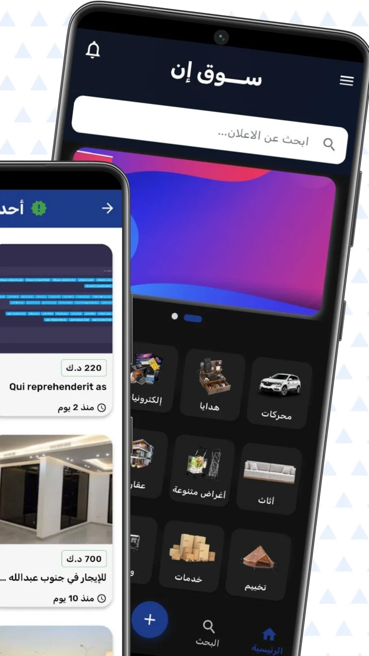
A classifieds marketplace needs to accommodate very different intentions. Someone may arrive with a specific car in mind, while another visitor wants to browse furniture or discover a service. SooqIn gives these journeys a shared starting point, combining a prominent search field with a visual category directory.
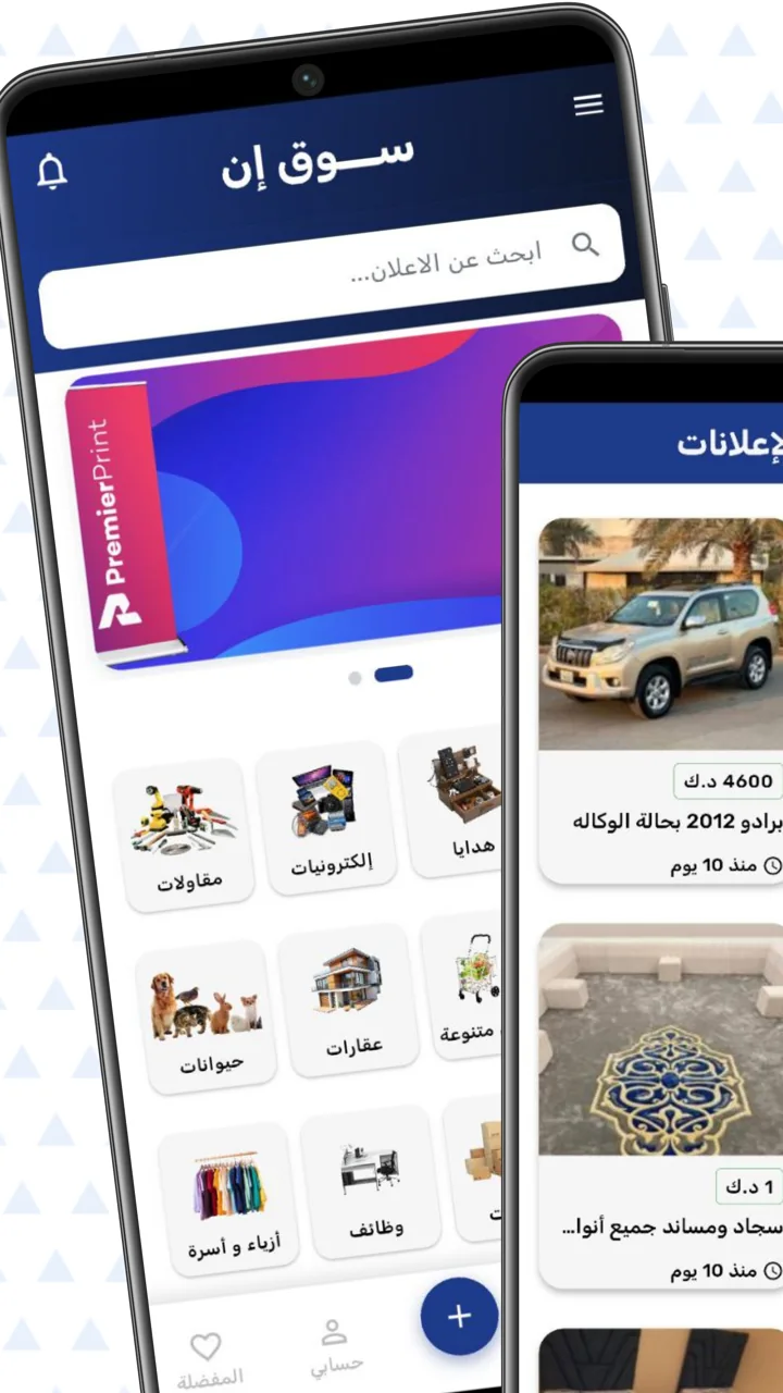
The interface introduces categories such as vehicles, electronics, property, gifts and household items through recognisable images. Listings then bring together a photograph, a title, a price in Kuwaiti dinars and a posting time. This structure makes the marketplace understandable before a visitor opens an individual advertisement.
02 / The experience
Make the next choice easy to see.
The design challenge in a broad marketplace is organisation. If every listing competes for attention at once, browsing becomes tiring. Here, the category grid gives the first screen a clear rhythm, while the search field supports visitors who already know what they need.
The supplied screens show both light and dark presentations. Across these views, familiar navigation destinations remain recognisable: home, search, account and favourites. The prominent add action also distinguishes the visitor who wants to publish a listing from the visitor who wants to explore.
The best starting point is the one that helps a visitor narrow the marketplace without losing the freedom to explore.
03 / Key details
Small details that support discovery.
A visual category directory
Category images provide a quick route into different parts of the marketplace. Their repeated layout keeps the navigation consistent even when the subjects range from vehicles to services.
Listings with useful context
Images lead the listing cards, with prices and posting times placed alongside the title. The visitor can assess the basic offer while browsing instead of opening every item to find those details.
A dedicated favourites view
Saved advertisements appear in their own list with a search field and remove controls. This gives visitors a place to return to interesting listings and keep their shortlist manageable.
04 / The user journey
From a broad idea to a shortlist.
Choose a starting point
Use the home search or select a category that matches the item or service you want to explore.
Compare the listings
Scan photographs, titles, displayed prices and posting times to decide which advertisements deserve a closer look.
Return to favourites
Use the saved list to revisit interesting offers, search within them and remove items that no longer fit.
05 / The screens
A closer look inside.
Explore the interface, screen by screen. Select an image to see the detail.
Discovery in a dark interface
Search, category shortcuts and listing previews form the marketplace’s starting screen.
Categories and classified listings
A light presentation pairs a visual directory with advertisement cards and visible prices.
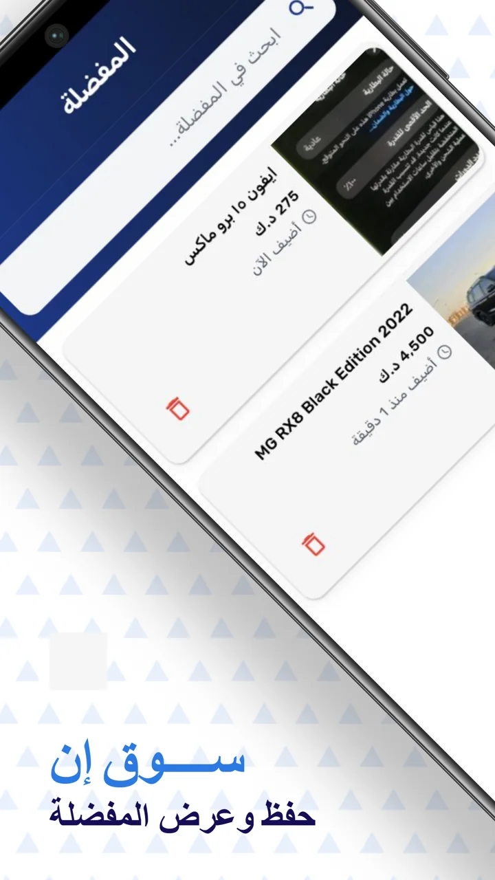
The personal shortlist
The favourites screen brings saved advertisements together with search and removal controls.
06 / The design perspective
Give variety a clear structure.
SooqIn shows how an interface can welcome a wide range of content without asking every visitor to browse it in the same way. Search serves a specific intention, categories encourage discovery, and favourites support the decision that takes more than one visit.
For a marketplace project, this is the central design lesson: make the available choices visible, give each listing enough context, and create a clear route back to items worth considering. The product’s breadth becomes useful when the navigation makes it feel approachable.
Let’s discuss your project