
06Project story
Golden Cart
Everyday shopping, with a clear next step.
Golden Cart presents a mobile shopping journey from discovering a store to reviewing a product and confirming an order, with the details of each choice kept in view.
- Field
- E-commerce
- Experience
- Mobile application
 Inside the product
Discover stores and categories
Review products and quantities
Understand the checkout
Project story
The project, at a glance
- The user need
- Store customers need to move from product discovery to an ordering decision.
- The interface approach
- Organise product information and shopping destinations in a consistent mobile interface.
- What the public screens show
- The product screens demonstrate the store browsing experience and shopping presentation.
This summary is based on the project screens already published in this portfolio. Usage statistics and business performance are not reported here.
Explore the supporting screens →01 / The idea
Connect browsing with the buying decision.
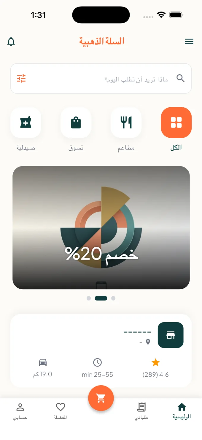
A shopping app needs to welcome visitors who are still exploring and support those ready to order. Golden Cart starts with a search field and category choices covering restaurants, shopping and pharmacies, then moves towards focused product and checkout screens.
The home interface gives store cards their own context, including displayed ratings, distance and delivery estimates. The bottom navigation separates home, orders, favourites and account, with the cart action given a prominent central position. These destinations keep the shopping journey recognisable as the visitor moves between stages.
02 / The experience
Make the purchase understandable as it unfolds.
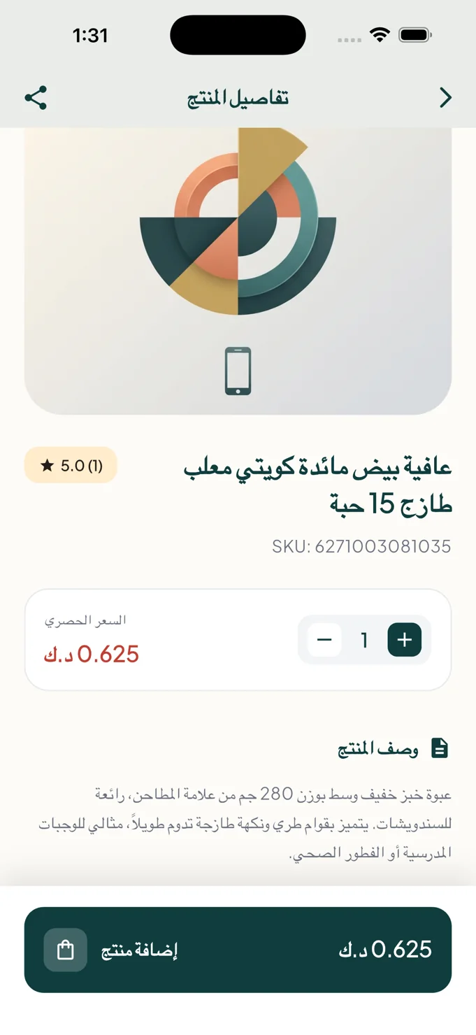
The product page brings together an image, name, identifier, displayed rating, price and description. Quantity controls sit next to the price area, while an add-product action remains visually distinct. The page supports a specific decision rather than asking the visitor to infer what happens next.
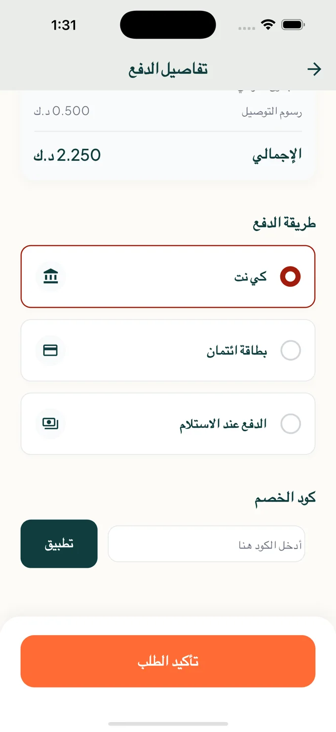
The checkout view changes the emphasis from discovery to review. Charges and the total are separated from payment selection, and a coupon field has its own action. The final confirmation button sits after these decisions, creating a readable sequence through the order details.
A checkout should make the order and the available choices clear before asking the visitor to confirm.
03 / Key details
A shopping experience in three clear layers.
Category-led store discovery
A familiar category row offers routes into restaurants, retail and pharmacies. Store cards include practical browsing context, while search supports the visitor with a more specific intention.
Product detail and quantity controls
The detail screen combines the product image, descriptive text and displayed price with a quantity selector. The add action is separated from the reading area, giving the page a clear continuation.
A structured order review
The payment-selection screen presents KNET, card and cash-on-delivery choices alongside the total and coupon entry. These are interface options shown in the project screenshots, organised before order confirmation.
04 / The user journey
From discovery to order review.
Choose where to shop
Browse categories or use search, then review the store information that fits your order.
Select the product and quantity
Read the product details, check the displayed price and adjust the quantity before adding the item.
Review the checkout choices
Inspect the order total, payment selection and any coupon entry before using the confirmation action.
05 / The screens
A closer look inside.
Explore the interface, screen by screen. Select an image to see the detail.
The shopping starting point
Search, categories, promotions and store context share the home screen.
The product decision
Product information, price and quantity controls sit beside a distinct add action.
Review before confirmation
The checkout presents the total, payment choices and coupon entry in a clear sequence.
06 / The design perspective
Keep momentum without hiding the details.
Golden Cart pairs warm orange action accents with deep green headings and generous light surfaces. Repeated rounded panels organise the content, while the strongest colour draws attention to the action appropriate to the current screen.
The design lesson is a practical one: browsing, selecting and confirming need different kinds of information. Giving each stage its own hierarchy can keep the journey moving while allowing visitors to understand the product, quantity and order they are considering.
Let’s discuss your project